1. How Coronaviruses Work

What is a coronavirus, and how does COVID-19 fit into the mix? This educational scrolling infographic by SCMP walks you through some of the more familiar types of coronaviruses, how they spread, and how they affect the human body. It also relates COVID-19 to other coronaviruses that cause diseases such as Mers, Sars, and even the common cold.
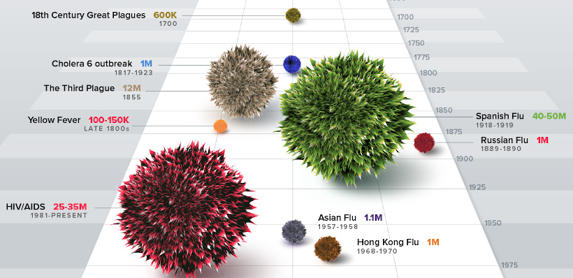
2. The History of Pandemics

On March 11th, the World Health Organization declared COVID-19 a pandemic. In this infographic, we look at the data to show you the history of pandemics — all the way from the Black Death to how the current COVID-19 situation. It helps give the historical context on how bad a pandemic can be. It’s also updated every day so you can see how COVID-19 compares to the impact of these previous events.
3. Coronavirus Simulator: Limiting the Exponential Spread

Why does the virus spread at an exponential rate, and what techniques can be used to mitigate that spread? This fantastic interactive page by the Washington Post actively simulates what happens when the virus spreads normally, contrasting it to how it may spread in a forced quarantine environment or when social distancing is practiced.
4. Real-time COVID-19 Map

If you haven’t seen this useful real-time dashboard by Johns Hopkins University yet, it’s worth bookmarking right now. We check the resource every day, and it has the latest numbers for COVID-19 cases, deaths, recoveries, and more — and it’s all sorted by country and/or state and province. Importantly, it also updates in real-time, so you always know you are getting the latest numbers.
5. Which Countries are “Flattening the Curve”?
Our post on which countries are “flattening the curve” has had over a million views in the last week alone, and it features the above interactive graph from Our World in Data. Go to the post itself to see a bigger version of the logarithmic chart, which plots the progress of different countries in flattening the curves of COVID-19 infections. The interactive chart updates daily based on the latest numbers, and you can actually search for any country by using the “Search” button. Using the filters on the right side, you can also sort by region as well.
6. Tracking the Coronavirus: The Latest Figures

Even though the Financial Times is a subscription-based website, it recently published this useful COVID-19 dashboard and made it accessible to everyone. It features various charts and tables on the countries affected, as well as ongoing assessments on the economic damage caused by the virus. Like many of the other COVID-19 resources featured on this list, it is updated on a daily basis.
7. COVID-19 Stats and Research
The above graphic is one of many available on Our World in Data, a fantastic initiative led by economist Max Roser.
Read the original full article here.